The deeper meaning of EVERY data
Maybe is that we must learn to “get” data.
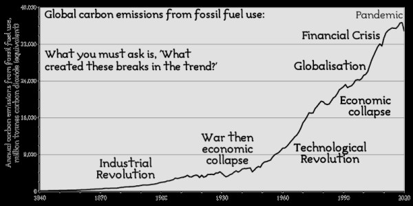
There is a post at the Free Range Activism Website about the “deeper meaning buried in the data on carbon emissions” that analyzes and visualizes those data with charts like this:

to conclude that, if human societies must replace fossil fuels:
- Simply changing energy sources is insufficient - We must directly cut energy use significantly at the same time
- The deeper truth in the data is that “Recession is good for the environment!”
- Only by shrinking the economy, to contract the ecological demands of the modern lifestyle, will we solve these critical problems
Sure, but let’s talk numeracy
In 2022, practically everybody does know for sure that “recession is good for the environment”, if nothing else because COVID-19 made THAT point very clearly.
The real topic of this post, however, is not pollution, growth, degrowth or climate change. Whatever you think of those issues, please focus on this other quote of THAT post now:
“Too often people look at statistics and just see the “magnitude” of the numbers, not the “meaning” that those numbers convey. [Indeed] a simple graph can show far more than just the raw numbers for carbon emissions."
“The purpose… is not to quote you the awful figures on carbon emissions from fossil fuels. It’s to tell you the detail, or the reality, that is too often left unstated when quoting numbers – and how the data show that."
The same concept, may be expressed in simpler English by saying that learning how to recognize good charts on whatever subject:
- is NOT rocket science
- has already become an absolutely necessary basic skill in the current world
- is stuff that could and should be taught in every school, probably around 11/12 years of age, almost surely not later than 14. Even before programming, probably
So, do go read that whole post to see how it is possible to “reformat” any chart to explain much better what it means, and why it is so important.
Who writes this, why, and how to help
I am Marco Fioretti, tech writer and aspiring polymath doing human-digital research and popularization.
I do it because YOUR civil rights and the quality of YOUR life depend every year more on how software is used AROUND you.
To this end, I have already shared more than a million words on this blog, without any paywall or user tracking, and am sharing the next million through a newsletter, also without any paywall.
The more direct support I get, the more I can continue to inform for free parents, teachers, decision makers, and everybody else who should know more stuff like this. You can support me with paid subscriptions to my newsletter, donations via PayPal (mfioretti@nexaima.net) or LiberaPay, or in any of the other ways listed here.THANKS for your support!