On the meaningless reporting on COVID19
Or many other topics, of course.
Please have a look at these two bits of “news”, in which the real news is a very general problem, that just happens to be more visible (and more dangerous), in this specific moment, around the whole COVID19 pandemic:
“Brazil has now reported more than 1 million confirmed cases of coronavirus… Many experts believe the number of cases could surpass the United States and that Brazil may soon become the country worst hit by the virus."
This other article is even worst, because of this chart:
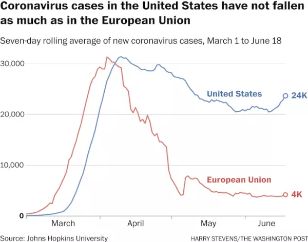
that is partially (but only implicitly) redeemed by this specific sentence:
“Despite its far older population, Germany has confirmed fewer than 9,000 coronavirus-linked deaths, compared with almost 120,000 in the United States. (Germany has about one-fourth of the United States’ population.)"
Why such reporting is meaningless
Charts and statements like those are really meaningless, if not idiotically dangerous. They also are a deeply unprofessional way to visualize and report crucial data. The reason is very simple: it makes no sense to compare cases among countries of (wildly) different populations. Fifty people dead in a 500 people village is a much worst situation than 100 people dead in a city of one million residents.
Look again at the chart above, but taking into account that, in June 2020, the European Union has about 447 million inhabitants, and the US, about 331 millions.
The EU has 35 per cent more people than the US. Consequently, the number of cases per million inhabitants, which is the only way to compare apples with apples, is (on the right edge of that chart):
EU = 4K/447 ~ nine per million
US = 24k/331 ~ seventy-two per million
Explanation: To the extent that the number of cases is a meaningful description of the status of the pandemic in each country, the situation in the US is not just six times worst than in EU. It is eight times worst. Or, alternatively, 30 per cent worst than that chart may make you believe.
Charts like these, seen in this tweet, make a much better, albeit still far from complete job of explaining the situation how it really is:
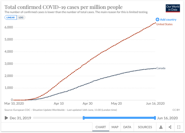
This is why it is stupidly, dangerously misleading to just report that Brazil (~212 million people) has more total deaths than US or, for that matter, that the US has more total deaths than Italy.
This is so obvious that it is terribly frustrating to see media continuously doing this mistake, and having to point it out. Yet (paragraph added on July 2nd) it keeps happening! Look at this other graphic that should “explain why Americans are facing an EU travel ban”:
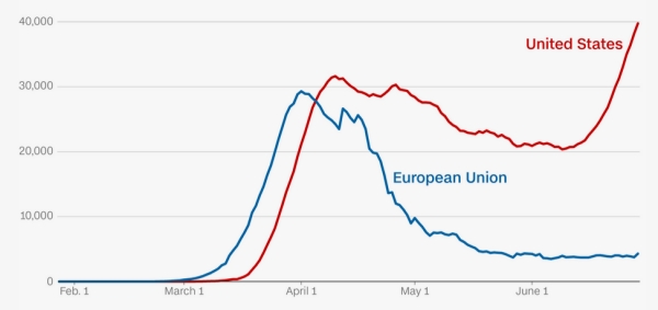
Sure enough, the main explanation of the travel ban is still there, and is the steepness of the US curve, versus the relative flatness of the EU one. This clearly conveys the message that the situation in one place seems (relatively speaking) under control, and in another is surely, quickly getting worse. But it doesn’t show how worse. If the chart properly scaled according to total population, it should show that, at the end of June, it’s not “4K cases stable vs 40K, increasing”. It would say “9 cases per million people, stable, vs 120 cases per million, and still growing”.
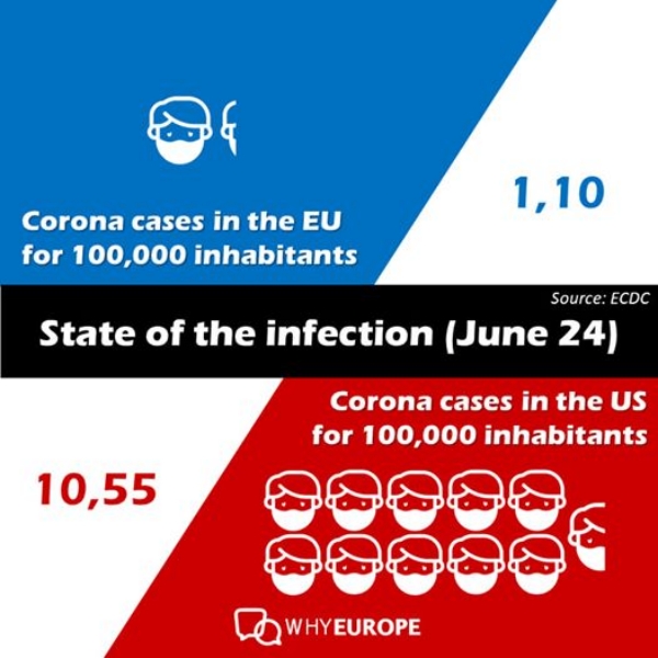
For a summary of this whole post in one picture, just look here:
(This post was drafted in June 2020, (and updated on July 2nd) but only put online in August, because… my coronavirus reports, of course)
Who writes this, why, and how to help
I am Marco Fioretti, tech writer and aspiring polymath doing human-digital research and popularization.
I do it because YOUR civil rights and the quality of YOUR life depend every year more on how software is used AROUND you.
To this end, I have already shared more than a million words on this blog, without any paywall or user tracking, and am sharing the next million through a newsletter, also without any paywall.
The more direct support I get, the more I can continue to inform for free parents, teachers, decision makers, and everybody else who should know more stuff like this. You can support me with paid subscriptions to my newsletter, donations via PayPal (mfioretti@nexaima.net) or LiberaPay, or in any of the other ways listed here.THANKS for your support!